Campus Maps
Due Diligence Guidelines Contents
Appropriate Maps
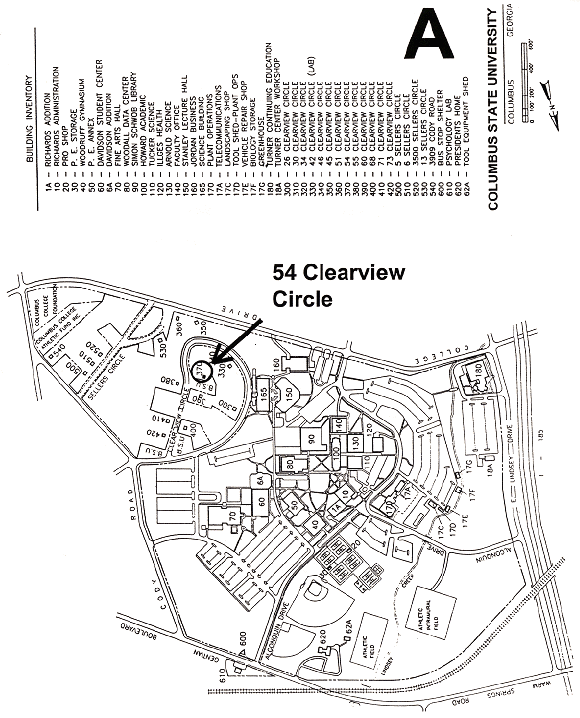
Example A
- Correct name of Institution
- Text large and clear
- Buildings clearly identified
- Subject of map in middle of map
- Text identifying subject large
- Subject of map circled for clarity
- Directional arrow clearly visible
- Simple map not overburdened by detail
- Limits of campus clearly identified
- Could be further improved by:
- Less detail such as sidewalks and parking lot dividers
- Orient map so north is to top of page
- Identify only major buildings
- Identify only major roads and in larger type

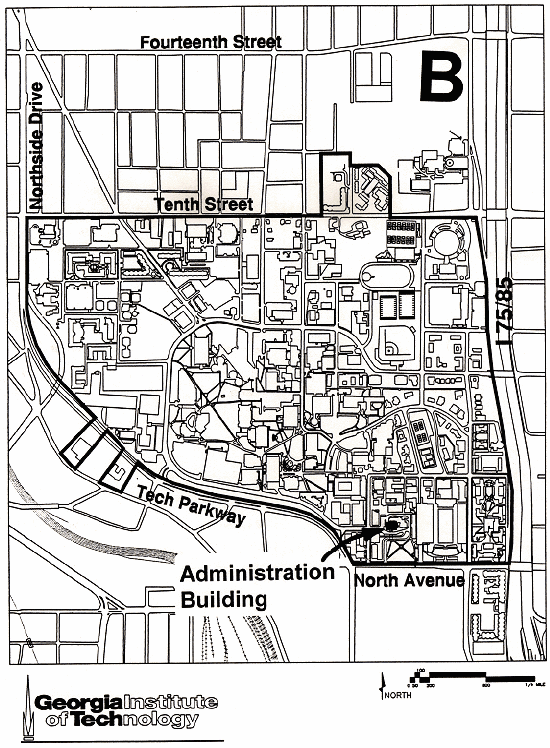
Example B
- Correct name of Institution
- Text large and clear
- Only major identifying streets are names
- Subject of map shaded for clarity
- Text identifying subject large
- Subject of map clearly identified
- Directional arrow clearly visible
- Campus is provided a certain level of detail that does not overburden presentation
- Area outside campus has limited detail
- Limits of campus clearly identified
- Could be further improved by:
- Less detail such as sidewalks
- Differentiate buildings and parking and roads
- Identify some major buildings

Deficient Maps
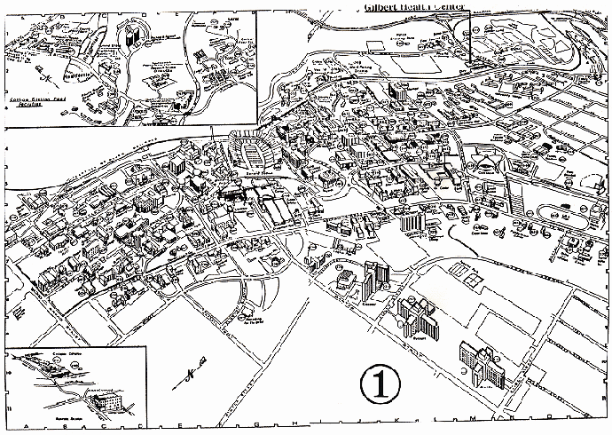
Example 1
- Isometric
- Too much detail
- Illegible text
- Subject of map almost off map
- Text identifying subject not visible enough
- Reference grid unnecessary
- Directional arrow not clearly visible
- Limits of campus not clearly identified

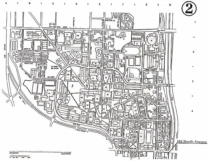
Example 2
- Too much detail
- Illegible text
- Subject of map almost off map
- Text for subject almost off page
- Text identifying subject not visible enough
- No buildings identified
- No directional arrow
- Reference grid unnecessary
- Limits of campus not clearly identified

